 Mar 13, 2025
 517
517 0
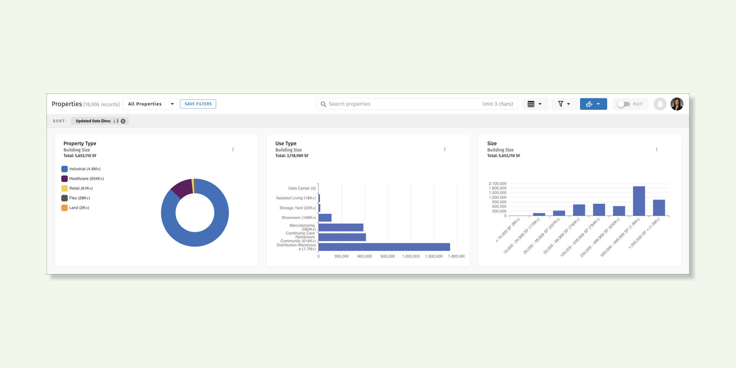
0The introduction of our Data Visualizations icon across multiple modules, now featuring graphs and pie charts that simplify complex data into clear, actionable insights. The ability to visualize all your data through interactive graphs and charts provides a clearer understanding of key metrics, making it easier to spot trends, monitor performance, and uncover valuable insights. With real-time updates and customizable visualizations, users can make more informed, data-driven decisions to optimize strategies and improve overall efficiency.
These visualizations are now available in the following Slick Cactus modules.
The icon is located between the Filter and the Map toggle.
![]()
Read more: LinkedIn Post

As CTO Nan is spearheading efforts to elevate the brand awareness of Slick Cactus within the commercial real estate industry.